
Systems Architecture
& Case Studies
Systems Architecture & Case Studies
Proof of Capability Rooted in Business Intelligence & Executive Leadership
Welcome to our operational archive. Below is a curated index of digital platforms, visual identity systems, multi-channel campaign ecosystems, and technical publications engineered with 25 years of editorial layout, corporate management, and MBA-level strategy behind them. Every case study represents a functional business asset designed to resolve complexity, establish market authority, and drive predictable growth. Use the navigation matrix below to explore specific strategic disciplines.
Digital Architecture & Ecosystem Development
Conversion-centric web platforms rooted in MBA-level strategy.
We engineer high-performance web environments that serve as strategic assets, not just digital brochures. Leveraging a 25-year background in communications and an MBA-driven approach, we translate technical specifications into clear, conversion-centric platforms for any industry.
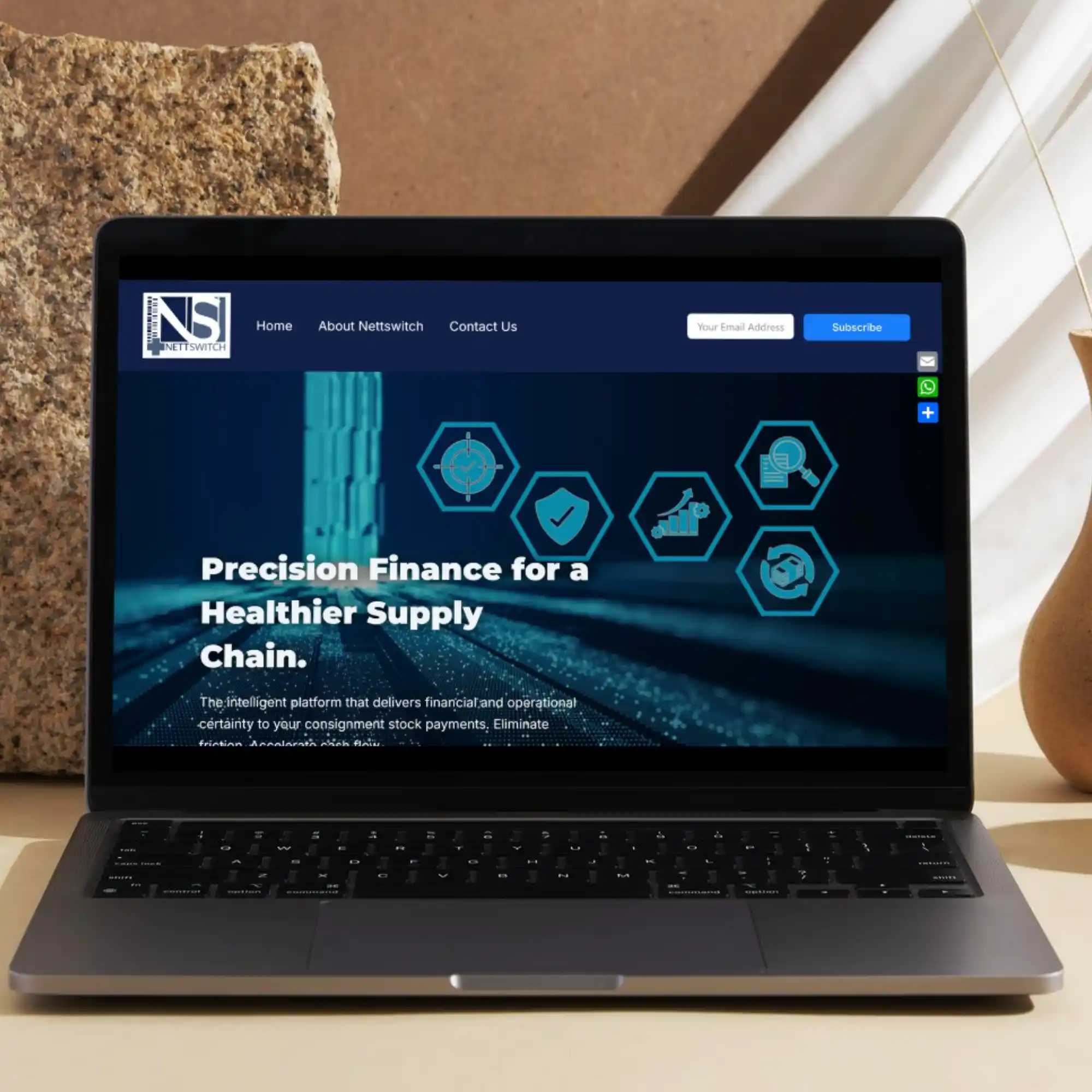
Company: Nettswitch
INDUSTRY: Medical FinTech
We built an API-first visual narrative that simplifies the complexity of 90-day medical billing cycles.
OUR FOCUS:
- Website Strategy, Design and Development
- UI/UX Optimisation
- Wireframing
- Search Engine Optimisation (SEO) Fundamentals
- Generative Engine Optimisation (GEO) Fundamentals
- Answer Engine Optimisation (AEO) Fundamentals
- Website Security Fundamentals
- Platform Responsiveness
- Basic Social Media Integration
- Copywriting
The Narrative: A high-conversion landing page for a medical fintech startup. Designed to build early-market trust while explaining complex payment-switching logic to three distinct stakeholder groups.
Design Highlight: Use of a “Trust-Centric” layout with clear, icon-driven benefit sections for Providers, Funders, and Suppliers.
The Strategy: Transitioned from a “Product-First” to a “Solution-First” architecture to drive early-access signups.
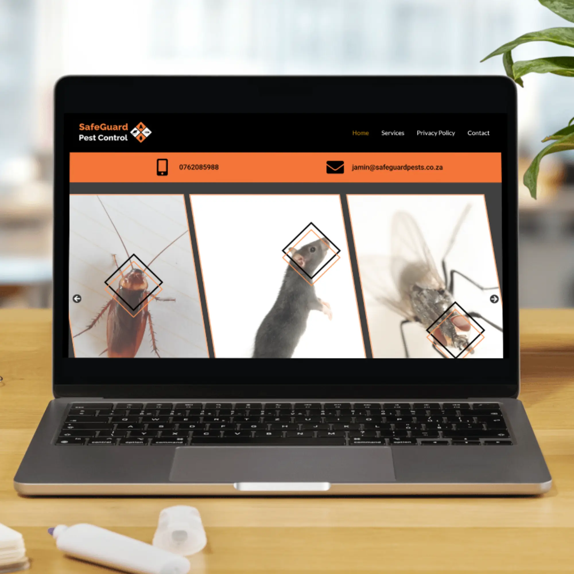
Company: SafeGuard Pest Control
INDUSTRY: Environmental, Facilities Management, and Hygiene Services
We engineered a lead-generation platform that balances technical regulatory compliance with user-friendly service navigation.
OUR FOCUS:
- Website Strategy, Design and Development
- UI/UX Optimisation
- Wireframing
- Search Engine Optimisation (SEO) Fundamentals, prioritising Local SEO
- Generative Engine Optimisation (GEO) Fundamentals
- Answer Engine Optimisation (AEO) Fundamentals
- Website Security Fundamentals
- Platform Responsiveness
- Basic Social Media Integration
- Copywriting
The Narrative: A results-driven service platform for a local specialist. Focused on rapid conversion through ‘Trust Signals’ and mobile-first accessibility.
Design Highlight: High-visibility CTAs (Call to Actions) and a dedicated section for “Entomology Inspections”—positioning the client as a regulated expert rather than just a general contractor.
The Strategy: Leveraged local SEO best practices and social proof (Google Reviews integration) to drive organic leads in a competitive regional market.
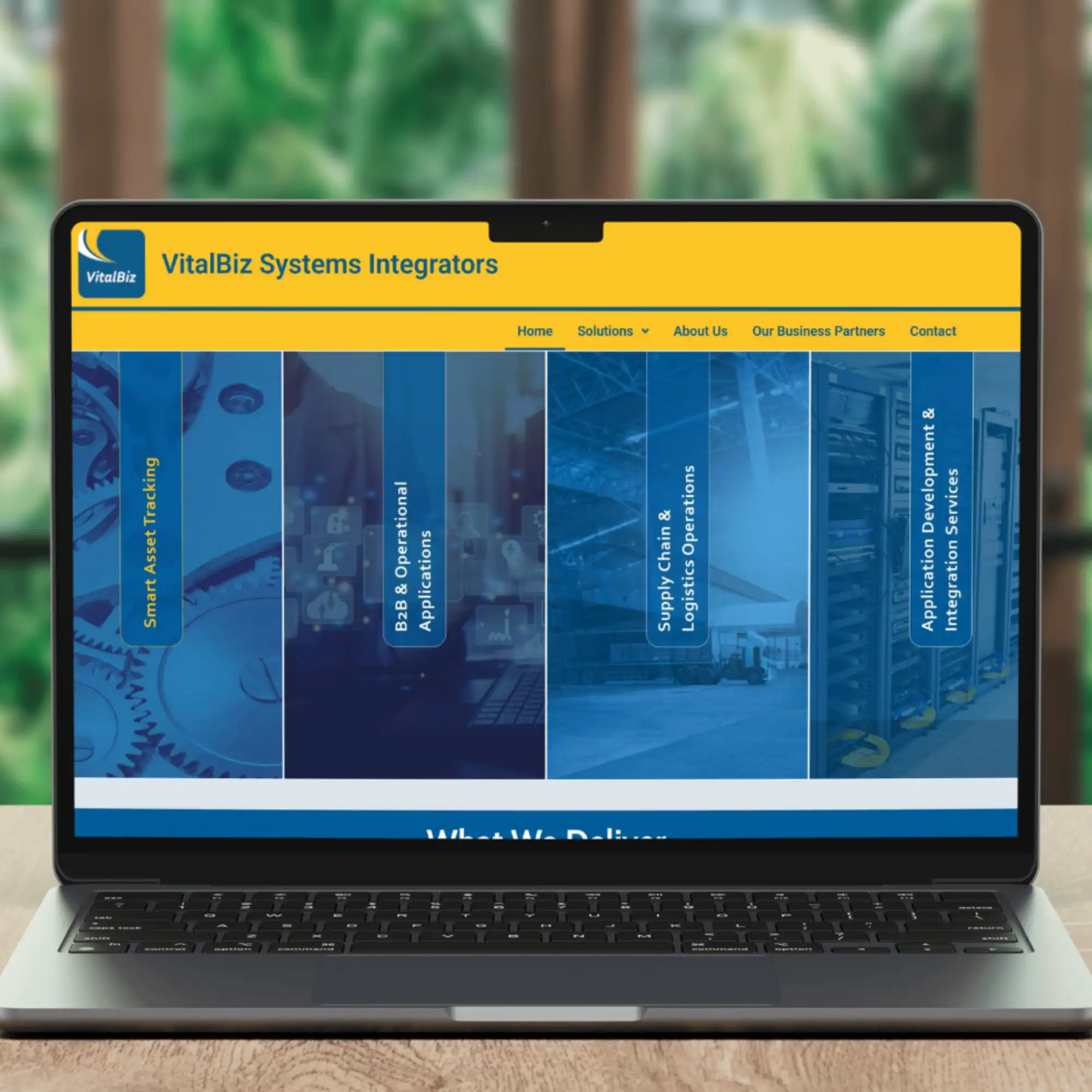
Company: VitalBiz Systems Integrators
INDUSTRY: Information Technology (IT) and Software
We designed a digital backbone for a systems integrator, focusing on clarity, technical authority, and modular product education.
OUR FOCUS:
- Website Strategy, Design and Development
- UI/UX Optimisation
- Wireframing
- Search Engine Optimisation (SEO) Fundamentals
- Generative Engine Optimisation (GEO) Fundamentals
- Answer Engine Optimisation (AEO) Fundamentals
- Website Security Fundamentals
- Platform Responsiveness
- Basic Social Media Integration
The Narrative: A comprehensive B2B knowledge hub for an enterprise systems integrator. The site serves as a digital sales consultant, categorising modular ‘Vital Suite’ applications.
Design Highlight: Structural hierarchy that explains “Modernisation without ERP replacement.” This is a strong business-case selling point.
The Strategy: Focused on “Information Architecture” – organising dozens of technical services (EDI, TPI, bizE) into a clean, navigable interface.
Strategic Identity & Visual Logic
Strategic design rooted in business intelligence.
We build Visual Identity Systems that bridge the gap between complex technical infrastructure and human-centric brand narratives. Each element of branding is a strategic asset designed for clarity, authority, and digital-first growth.
LOGOS

Company: Nettswitch
Industry: Medical FinTech
Concept: Precision Healthcare Fintech.
Visual Logic: Vertical bars mirror a barcode/data switch, representing the flow of capital and stock. The medical cross grounds the fintech aspect in healthcare, while the interlocking “N/S” monogram suggests a secure, closed-loop ecosystem.
The Vibe: Clinical & Secure. Designed to build immediate trust with institutional stakeholders and CFOs.
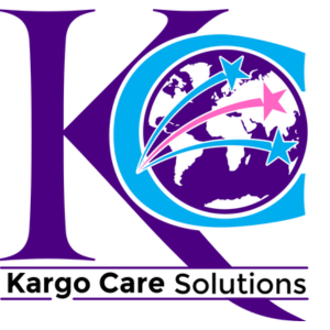
Company: Kargo Care Solutions
Industry: Import / Export
Concept: Global Velocity & Documentation Mastery.
Visual Logic: The interlocking “K” and “C” frame a global map, positioning the company as a gateway to international trade. The shooting stars symbolise the “velocity” of freight, while the precise serif on the “K” adds a layer of established, consultant-level professionalism.
The Vibe: Dynamic & Comprehensive. It communicates a “world-class” reach and the high-energy nature of global logistics and specialised export services.

Company: The Fundi Group
Industry: Services and Construction
Concept: Modular Brand Architecture.
Visual Logic: A “Master Brand” system. The consistent yellow concentric circles represent a “halo of reliability.” The central “Home” icon acts as a modular anchor, swapped across sub-divisions to maintain group equity while identifying specific expertise. Their sub-divisions included a diverse range of services under Pool Fundi, Fundi Power, and Fundi Services.
The Vibe: Vibrant & Foundational. High-contrast colours ensure visibility in the field while conveying reliability.
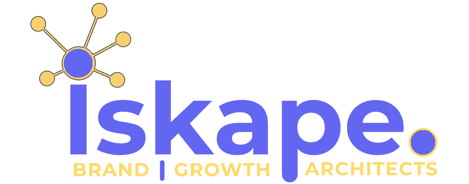
Our Company Logo
Industry: Digital Transformation & Growth Consulting
Concept: The “Nexus” for AI-Augmented Growth.
Visual Logic: We treated our own agency as Client Zero. For Iskape, the strategic objective was to engineer a visual identity that balanced ‘Big Tech’ innovation (AI-augmented intelligence) with 25 years of strategic communications authority. The neural node integrated into the brand mark reflects seamless data connectivity, while our high-contrast design system anchors our market position in the South African SMME landscape.
The Vibe: Techno-Optimistic. A marriage of strategic wisdom (Indigo) and innovation (Pastel Yellow).
LETTERHEADS
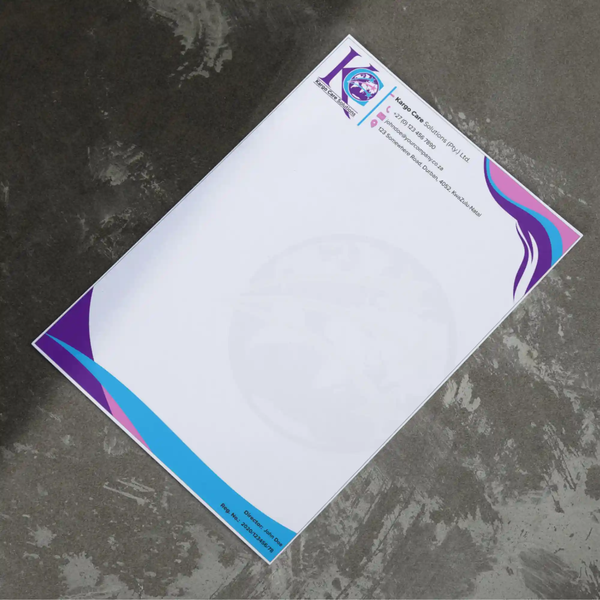
Company: Kargo Care Solutions
INDUSTRY: Import / Export
The Synopsis: We engineered a cohesive corporate stationery system for Kargo Care Solutions that utilises dynamic fluid geometry and watermark layering to reinforce brand authority while ensuring clear, structured communication for logistics documentation.
Dynamic Framing: The use of sweeping, multi-coloured curves in the header and footer is not just decorative; it creates a “visual bracket” that contains the content, providing a sense of motion and momentum appropriate for a logistics company.
Information Hierarchy: By isolating the contact details in a clean, icon-led block at the top, the design ensures that critical communication data is instantly accessible without cluttering the primary message area.
Compliance & Professionalism: The footer is strategically reserved for formal director and registration details, demonstrating an understanding of South African corporate compliance (CIPC) and the structural requirements of formal business correspondence.
Watermark Subtlety: The large-scale central watermark of the logo icon serves as a subtle security and branding feature. It anchors the page and prevents the white space from feeling “empty” while remaining light enough to ensure maximum legibility for overlaid text.
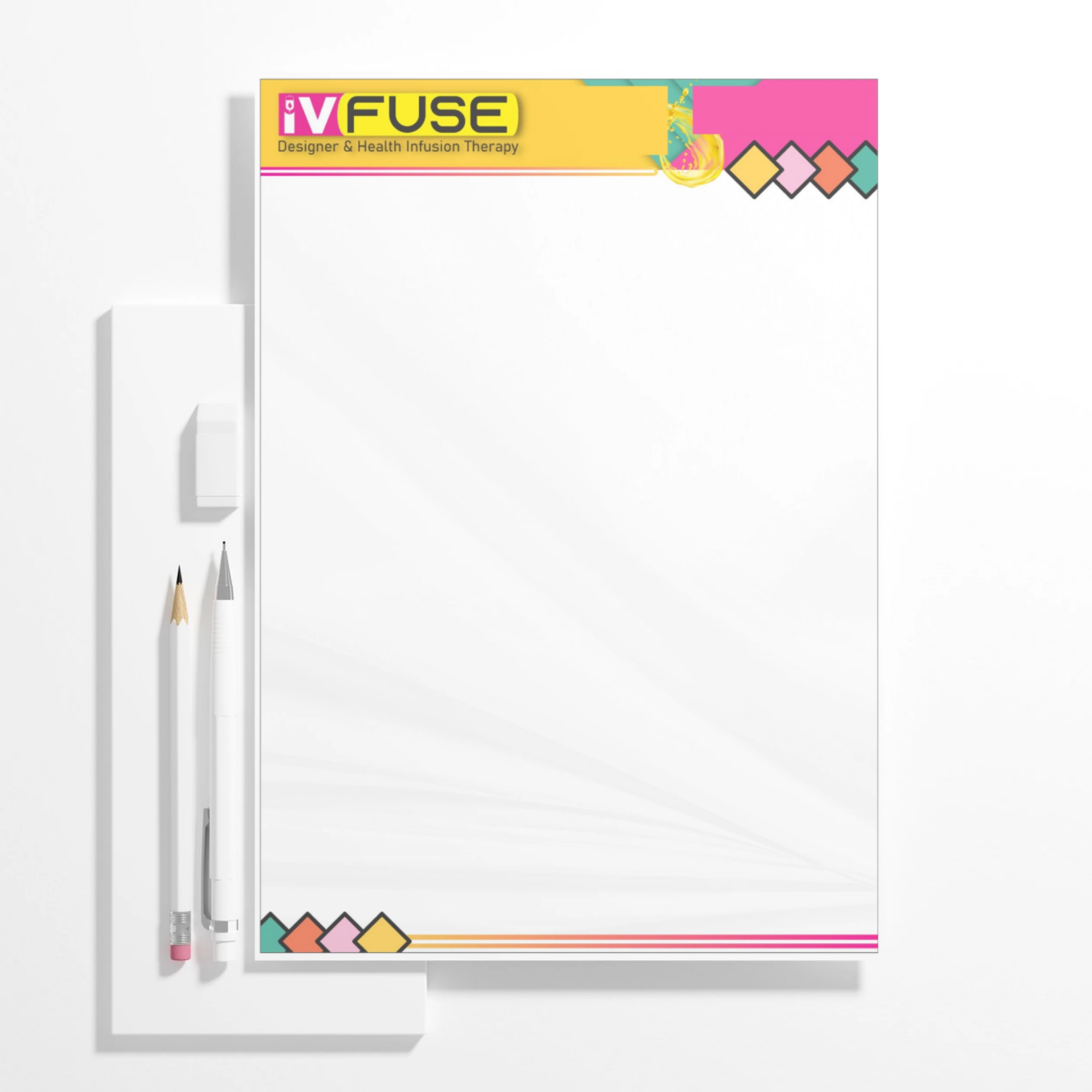
Company: IV Fuse
INDUSTRY: Health and Wellness
The Synopsis: We translated a high-impact clinical brand into a professional stationery system, using geometric framing and fluid liquid motifs to communicate precision and vitality while maintaining a structured information hierarchy for medical-grade correspondence.
Z-Pattern Hierarchy: The design leverages a ‘Z’ eye-flow pattern, placing the high-visibility logo in the top-left and the contact details in the top-right, anchored by a multi-coloured geometric footer that balances the page.
The Vibe: Vibrant & Structural. It feels like a premium “Boutique Medical” document. The bright palette and liquid imagery suggest health and energy, while the strict alignment and diamond geometry suggest the precision of an engineered treatment plan.
Subtle Radial Texture: The background uses soft, radiating white lines from the bottom center, which adds depth to the page and guides the eye toward the content without interfering with document legibility.
Fluid Fluidity: The inclusion of the realistic liquid ‘splash’ graphic provides an organic counterpoint to the rigid geometry of the layout, reinforcing the literal nature of “infusion” and the concept of hydration.
Segmented Header: By using a horizontal yellow bar to separate the physical location from the digital contact info, the design creates ‘data pockets’ that prevent the top of the page from feeling cluttered, even with a high volume of information.
Chromative Encoding: The diamond-shaped ‘menu’ in the header and footer uses the brand’s secondary palette to represent the various “fuses” (treatments) offered, turning a purely decorative element into a visual representation of product variety.
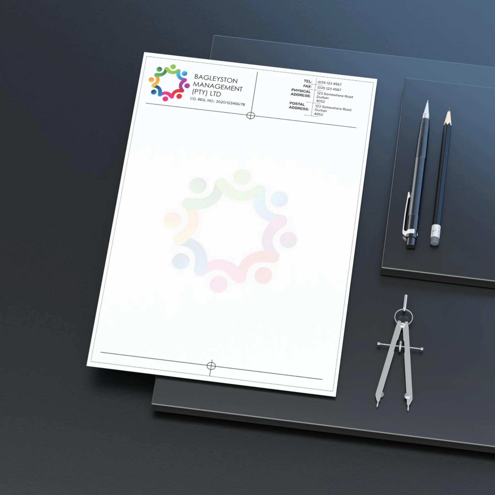
Company: Bagleyston Management
INDUSTRY: Finacial Services
Bagleyston Management
The Synopsis: We engineered a high-precision corporate letterhead for a capital investment firm, utilising minimalist grid-theory and mathematical registration markers to communicate a culture of transparency, audit-ready accuracy, and multifaceted asset management.
Segmented Information Pockets: By using light, dotted horizontal and vertical rules, the design categorises data (Tel/Fax, Physical, Postal) into distinct “cells.” This prevents the header from becoming a wall of text, ensuring rapid scannability for CFOs and investors.
Minimalist Compliance: The placement of the Company Registration Number directly beneath the logo ensures immediate legal compliance while maintaining a clean, clutter-free aesthetic, essential for institutional authority.
The Vibe: Institutional & Transparent. While the logo icon introduces a sense of human collaboration and diverse investment, the letterhead layout itself is “all business.” It feels like a secure, auditable document designed for a boardroom -clean, precise, and entirely focused on the integrity of the information it carries.
Symmetry & Balance: The design utilises a split-header layout, perfectly balancing the brand identity on the left with a structured contact block on the right. This creates a stable “horizontal axis” that suggests the equilibrium and grounded nature of a professional management group.
Precision Crosshair Markers: The inclusion of top and bottom centre-point markers (crosshairs) suggests “targeting” and mathematical focus.
Watermark Desaturation: The central watermark of the “Interlocking Portfolio” icon is rendered in a high-key, low-opacity wash. This reinforces the brand’s presence across the entire document without interfering with the legibility of high-volume financial text or legal fine print.
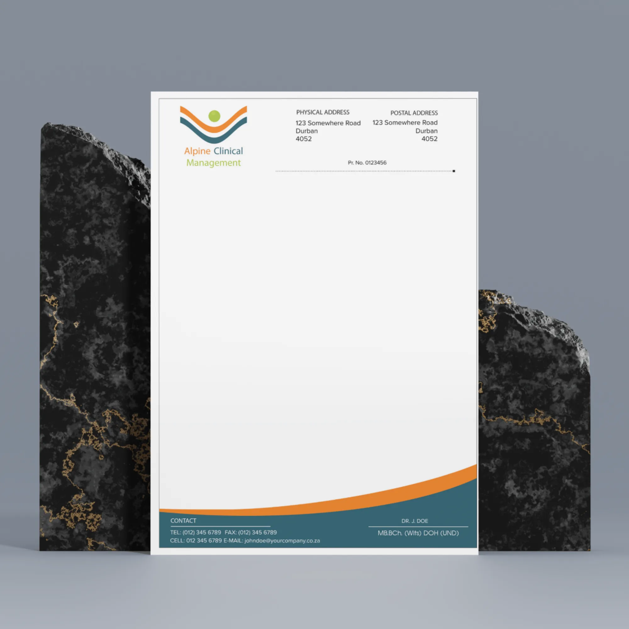
Company: Alpine Clinical Management
INDUSTRY: Healthcare
The Synopsis: We developed a ‘Precision-Safety’ letterhead for an Occupational Health provider, utilising ascending geometric motifs and a high-contrast information footer to communicate workforce vitality, preventative care, and rigid professional compliance.
Dual-Column Data Partitioning: The header utilises a mirrored “Physical vs. Postal” layout. This partitioning allows for a high volume of address data to be presented with maximum white space, ensuring that the critical “Pr. No.” (Practice Number) remains the central, unmissable focal point of the administrative block.
Practitioner Credentialing: Placing the Doctor’s name and specialised degrees (MB.BCh., DOH) in a dedicated, right-aligned block at the bottom creates a “Signature of Authority.” This ensures the document carries the necessary weight for legal workplace health audits and insurance submissions.
The Vibe: Vigilant & Proactive. The palette of safety-orange and lime-green removes the “coldness” of a hospital environment and replaces it with the energy of a “Workplace Partner.” It feels like a brand that is on-site and active, designed to reassure corporate clients that their workforce is under constant, professional, and uplifting care.
Ascending “Peak” Alignment: The logo’s triple-chevron “mountain” motif is positioned in the top-left, creating an immediate visual metaphor for growth and “Peak Health.” By aligning the brand name vertically alongside the mark, the design establishes a modern, breathable header that avoids the cramped look of traditional medical forms.
The “Horizon” Footer: The use of a deep slate-blue and safety-orange curved footer serves as a “grounding” element. Visually, it represents a horizon line, suggesting stability and the broad scope of occupational health; technically, it provides a high-contrast background that makes the doctor’s credentials and contact details pop for immediate recognition.
Functional Dotted Rule: The horizontal dotted line serves a dual purpose: it separates the static branding from the variable body text and acts as a visual guide for filing and categorisation, a small but vital detail for the high-volume paperwork typical of industrial health clinics.
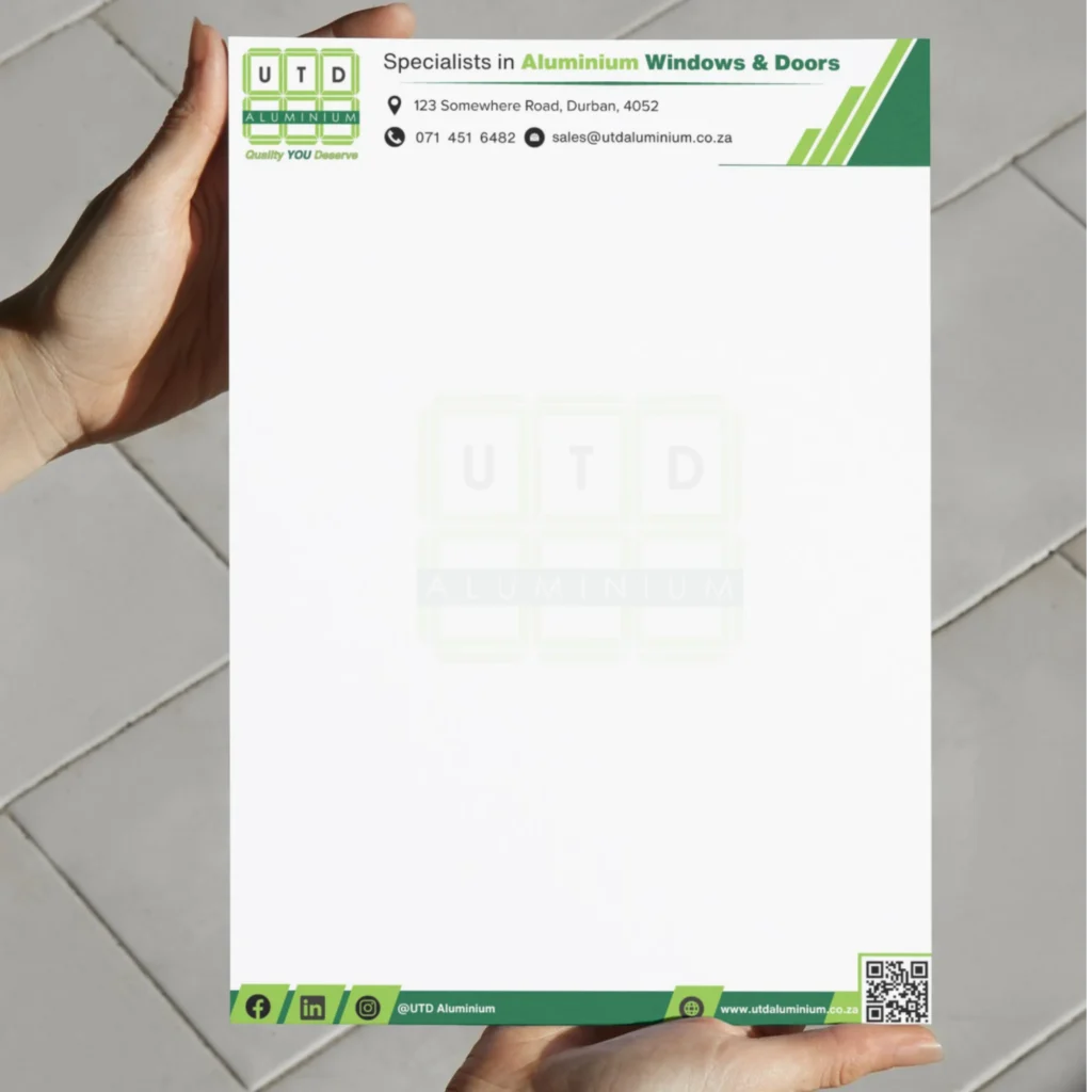
Company: UTD Aluminium
INDUSTRY: Manufacturing and Construction
The Synopsis: We developed this letterhead for a comprehensive aluminium window and door manufacturer and installer. The design leverages structural geometry and a ‘precision-to-craft’ colour palette to communicate turnkey reliability, bespoke fabrication quality, and seamless on-site execution.
Architectural Grid Branding: The primary logo, built from a segmented window-pane grid, is subtly repurposed as a large, central watermark. This reinforces the core product offering throughout the entire document area. By fading the motif into the background, we ensured that the identity is present without competing with the variable content of official quotes, agreements, or invoices.
The Vibe: Integrated & Reassuring. The palette of forest green (stability, trust, and craftsmanship) and safety-lime green (precision, innovation, and field vitality) shifts the visual message. It moves away from cold manufacturing and toward a narrative of a proactive “Building Partner.” It reassures clients that the same precision applied in the factory is brought to the final installation on-site.
Integrated Digital/Physical Footer: The dark footer bar is not passive; it acts as a digital portal. By featuring a prominent QR code linked directly to the website/portfolio, we ensured that physical correspondence can instantly launch a prospective client into viewing actual completed installations. The surrounding social media handles and web address are grouped with high-contrast icons for immediate recognition, emphasising easy communication.
Dynamic Geometric Headers: Sharp, 45-degree angled accents in two shades of green frame the top-right and bottom corners. These dynamic slants evoke structural framing, precision cutting, and the clean lines typical of modern architectural drafting. They are also positioned to frame the main contact details, guiding the eye directly to the information needed to initiate a project quote.
Direct Service Hierarchy: The letterhead header immediately cuts through ambiguity with the clear service statement: “Specialists in Aluminium Windows & Doors.” This, paired with detailed physical and postal addresses, immediately establishes UTD as a credible, established, and accessible manufacturer ready for substantial projects.
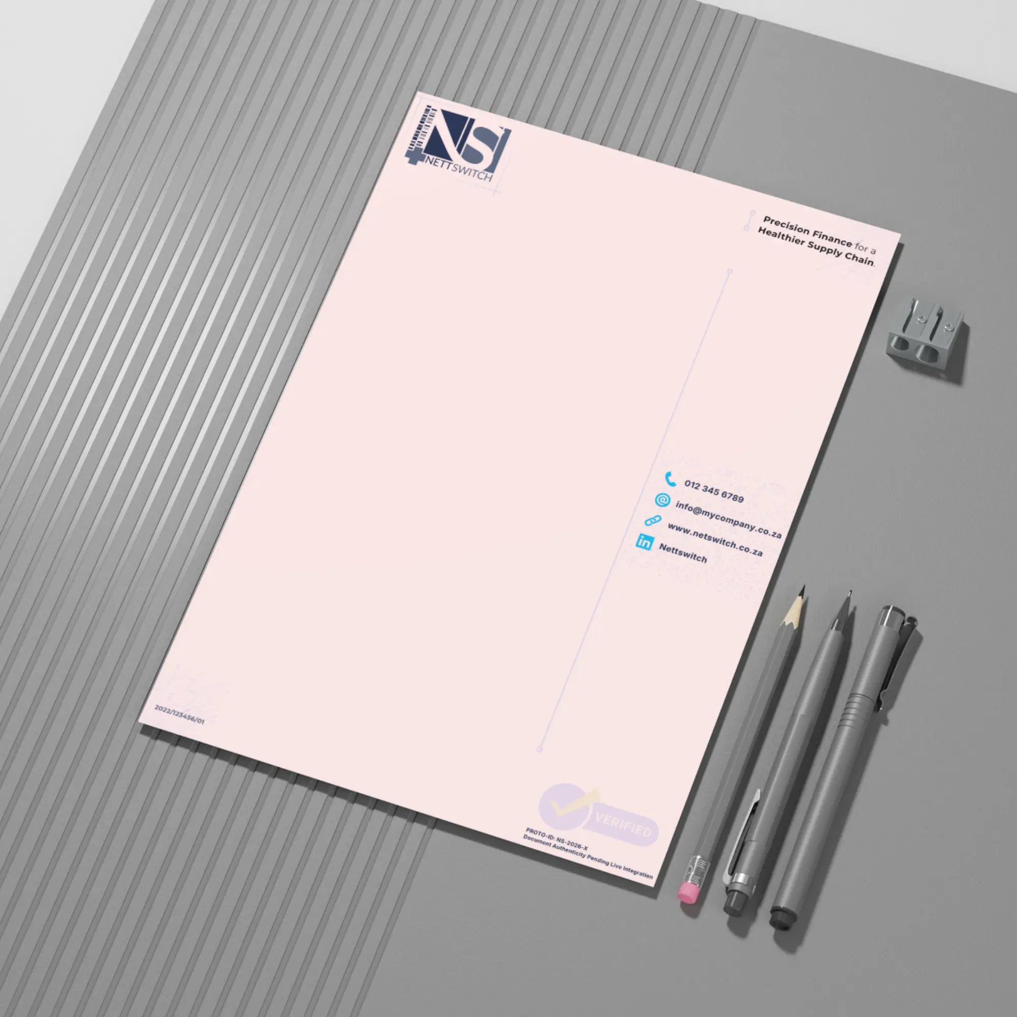
Company: Nettswitch
INDUSTRY: Medical FinTech
The Synopsis: We engineered a “Fintech Integrity” stationery layout for a healthcare payment switching platform connecting medical funders, suppliers, and care providers. The layout combines tech-forward circuit graphics, a structured vertical navigation bar, and explicit compliance cues to communicate operational security, real-time transaction processing, and absolute system reliability.
Vertical Margin Partitioning: By consolidating the primary contact channels into a dedicated right-hand sidebar bounded by precision crosshairs, the main page body maintains an uncluttered, high-whitespace canvas. This structural layout is specifically tailored for dense transactional data, corporate billing schedules, and technical API documentations without compromising visual clarity.
The Vibe: High-Security, Data-Driven, & Institutional. The clinical navy blue and vivid cyan palette balances the strict regulatory compliance required in medical funding with the modern agility of a software processor. The integrated circuit-board line art in the corners subtly reinforces backend connectivity, data flow, and digital switching capability.
System Verification & Traceability: The lower right section features a prominent “VERIFIED” badge motif alongside systemic tracking metadata (“PROTO-ID” and “Document Authenticity Pending Live Integration”). This gives the document the weight of a secure digital ledger, reassuring medical aids and hospital groups that printed documentation or formal correspondence is tied directly to a verified transaction layer.
Strategic Value Positioning: The top-right tagline—”Precision Finance for a Healthier Supply Chain”—immediately frames the platform’s dual role in financial technology and healthcare logistics. Coupled with the healthcare cross and barcode integrated into the main “NS” logo mark, the design visually unites medical care with secure financial switching.
Metadata & Regulatory Layout: Positioning the corporate registration details in the bottom-left, grounded over subtle circuit artwork, ensures regulatory requirements are met in a non-intrusive manner. It grounds the page technically while keeping the administrative metadata distinct from the main body content.
Nettswitch
The Synopsis: We engineered a “Fintech Integrity” stationery layout for a healthcare payment switching platform connecting medical funders, suppliers, and care providers. The layout combines tech-forward circuit graphics, a structured vertical navigation bar, and explicit compliance cues to communicate operational security, real-time transaction processing, and absolute system reliability.
Vertical Margin Partitioning: By consolidating the primary contact channels into a dedicated right-hand sidebar bounded by precision crosshairs, the main page body maintains an uncluttered, high-whitespace canvas. This structural layout is specifically tailored for dense transactional data, corporate billing schedules, and technical API documentations without compromising visual clarity.
The Vibe: High-Security, Data-Driven, & Institutional. The clinical navy blue and vivid cyan palette balances the strict regulatory compliance required in medical funding with the modern agility of a software processor. The integrated circuit-board line art in the corners subtly reinforces backend connectivity, data flow, and digital switching capability.
System Verification & Traceability: The lower right section features a prominent “VERIFIED” badge motif alongside systemic tracking metadata (“PROTO-ID” and “Document Authenticity Pending Live Integration”). This gives the document the weight of a secure digital ledger, reassuring medical aids and hospital groups that printed documentation or formal correspondence is tied directly to a verified transaction layer.
Strategic Value Positioning: The top-right tagline—”Precision Finance for a Healthier Supply Chain”—immediately frames the platform’s dual role in financial technology and healthcare logistics. Coupled with the healthcare cross and barcode integrated into the main “NS” logo mark, the design visually unites medical care with secure financial switching.
Metadata & Regulatory Layout: Positioning the corporate registration details in the bottom-left, grounded over subtle circuit artwork, ensures regulatory requirements are met in a non-intrusive manner. It grounds the page technically while keeping the administrative metadata distinct from the main body content.
Company: Kargo Care Solutions
INDUSTRY: Import / Export
Transforming passive audience reach into structured sales pipelines.
We specialise in the long-term management of digital identities. By developing hundreds of cohesive assets across focused brand lifecycles, we ensure that every touchpoint – from high-level educational content to direct sales pitches – maintains a unified visual logic and strategic intent.
Company: Nettswitch
Platform: LinkedIn
2025 - 2026
Credibility and Lead Generation in Healthcare Fintech
For the launch of Nettswitch, the strategic objective was to build immediate institutional trust for a pre-live payment switching platform. Targeting CFOs, hospital procurement leads, and Tier-1 suppliers, we developed a LinkedIn content ecosystem designed to pivot the brand from ‘new entrant’ to ‘industry innovator.’ The campaign focused on high-authority visual storytelling – using clinical, secure aesthetics to explain complex financial switching logic.
These assets served a dual purpose: establishing broad brand awareness while simultaneously driving a high-value lead funnel for beta platform testers. By balancing ‘The Future of Finance’ vision with the pragmatic requirements of healthcare stakeholders, we successfully identified and engaged the key decision-makers needed to validate the platform’s real-world application.”
Company: UTD Aluminium
Platform: Facebook and Instagram
2023 - 2026
High-Fidelity Visual Proof and Regional Lead Conversion.
The Execution: As an established manufacturer, UTD Aluminium’s digital presence was less about introduction and more about visual validation. We focused on a content strategy of “Proof of Work,” using high-contrast project showcases to highlight the precision of their installations. By showcasing the tangible transformation of residential and commercial spaces, we turned social media into a high-performance digital showroom that bridged the gap between a viewer’s interest and a formal request for a quote.
The Lead Engine: Beyond aesthetic appeal, the campaign was engineered for consistent lead acquisition in a competitive local market. We developed a cadence that balanced aspirational lifestyle imagery with direct, “hard-hat” industrial reliability, specifically targeting homeowners and commercial developers. By maintaining this high-frequency, high-quality digital footprint, we ensured that the brand’s long-standing reputation was supported by a modern, active presence that converted passive engagement into active sales inquiries.
Company: The Fundi Group
Platform: Facebook
2024
Unified Brand Architecture and Value-Driven Content Marketing
The Execution: In a market saturated with unverified, small-scale contractors, my primary objective was to establish The Fundi Group as the professional gold standard across three distinct divisions. We implemented a Modular Brand System, so whether a customer engaged with Pool Fundi, Fundi Power, or Fundi Services, the visual identity remained consistent and authoritative. By maintaining this high level of “Brand Stewardship,” we created a cross-pollination effect, where trust earned in one service line (e.g., electrical) naturally transferred to the others (e.g., pool maintenance), effectively insulating the brand from lower-tier competition.
The Content Mix: To drive engagement and lead generation, I moved beyond traditional “hard-sell” tactics by developing three core content pillars: Educational (helping homeowners navigate complex solar power systems), Lifestyle/Entertaining (summer pool activities for families), and Functional (direct maintenance service offers). This multi-layered approach humanised the brand and provided genuine value to the community, positioning the group not just as a service provider, but as a trusted household resource. This strategy successfully cut through the market noise, converting passive social followers into a consistent pipeline of qualified leads for all three divisions.
Company: Maths Lessons
Platform: Facebook
2023
Full-Funnel Social Media Strategy and Digital Service Conversion
The Execution: The EdTech (education technology) market is a competitive one, where parents are routinely inundated with generic study materials. With Maths Lessons, our goal was to position Maths Lessons as a trusted, accessible, and essential home-learning partner for South African families. To drive sales of downloadable video courses for Grades 1–12, we developed a high-contrast visual brand identity anchored in vibrant primary red. This high-energy palette cut through cluttered Facebook feeds while establishing immediate brand recall.
By strategically blending emotional resonance with clear commercial messaging, the campaign targeted both decision-makers (parents invested in academic success) and end-users (students needing approachable study aids).
The Content Mix: To maximise Facebook page growth and nurture leads from initial awareness through to direct video downloads, we implemented a balanced content strategy built around three distinct strategic pillars:
- Empathy & Family Dynamics (Top of Funnel): Leveraging relational imagery to highlight parental involvement during exam periods. This messaging validated the emotional stresses of studying, positioning the platform as a reassuring partner rather than just a software vendor.
- Relatable Humour & Engagement (Middle of Funnel): Utilising lighthearted math-themed comics, illustrated characters, and interactive elements to lower the barrier to engagement. This humanised the brand, encouraged social sharing, and built a welcoming community atmosphere.
- Direct Promotional & Incentive Offers (Bottom of Funnel): Crafting bold, urgency-driven promotional banners for seasonal sales (e.g., 50% OFF campaigns). These posts explicitly highlighted compliance with national curriculum standards (“NCS/CAPS Aligned”) and specific grade ranges to remove buying friction and directly convert traffic into video course purchases.
The Business Impact: By combining curriculum trust badges, emotional family storytelling, and engaging viral humor, the social media strategy was to grow page authority and build an active, trusting community. This multi-touch campaign structure was set to transform passive Facebook scrollers into active leads, consistently driving traffic to the digital store for paid video downloads.
Publication Design & Corporate Collateral
High-authority publication design engineered for print and digital ecosystems.
Beyond the screen, we design high-impact print assets that serve as the physical touchpoints of a corporate identity. From technical product catalogues to strategic executive summaries, my focus is on Information Hierarchy and Precision Typography, ensuring that every page reinforces the brand’s authority and market position. We also ensure they are suitable for digital distribution as well.
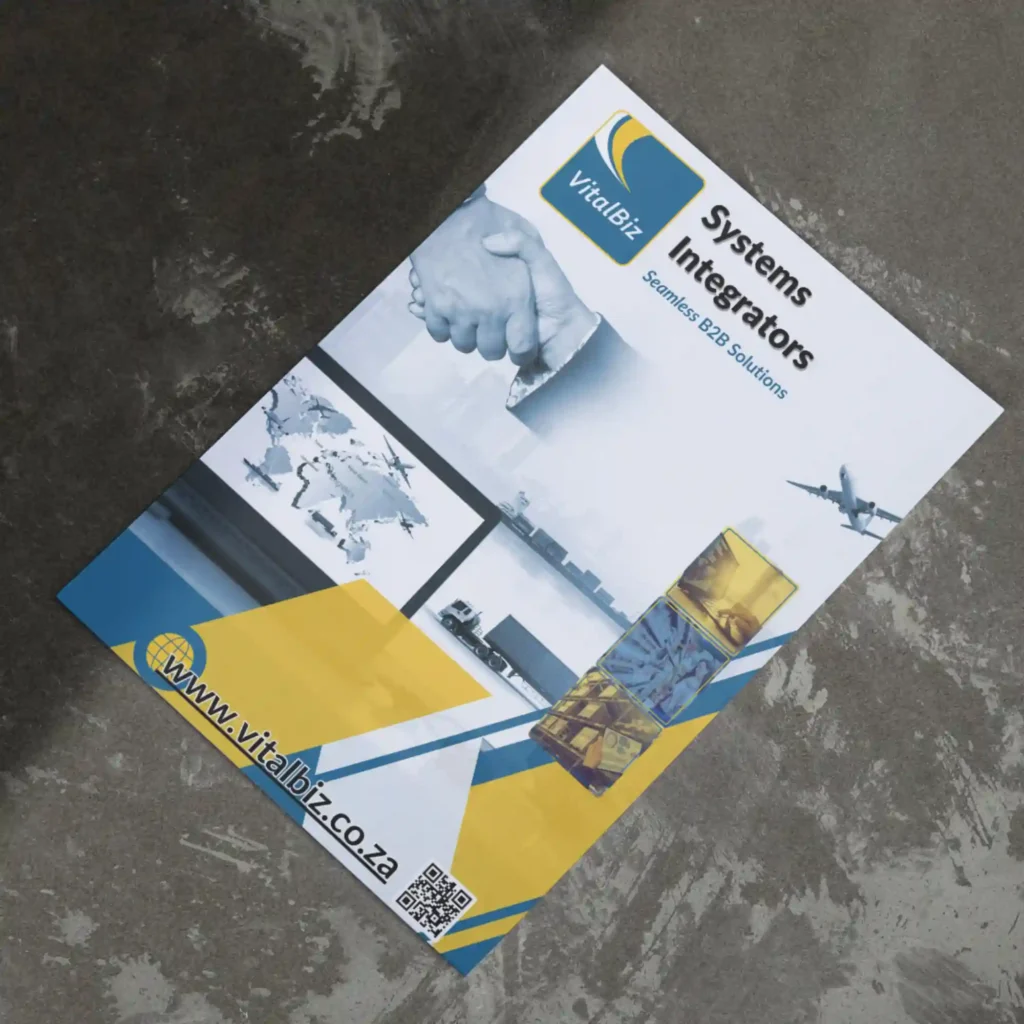
Company: VitalBiz
VitalBiz Systems Integrators
FORMAT: 14-Page A4 Portrait Technical Publication
INDUSTRY: Information Technology (IT) and Software
We designed a comprehensive corporate capability brochure that unifies B2B trading, retail supply chain management, and international freight logistics into a cohesive, high-impact publication, utilising structured modular grids and logistics data-flow architectures to demonstrate end-to-end enterprise integration.
The Business Perspective (The Strategy)
Focus: Enterprise Logistics, Multimodal Trade, & Import/Export Modernization.
While the previous publication focused strictly on internal software modules, this master brochure addresses the broader, macro-level supply chain ecosystem. The business goal was to demonstrate how VitalBiz bridges the gap between global shipping logistics (ports, container depots, and customs/Transnet integrations) and backend enterprise ERPs. By showcasing specialised solutions like the Traka Suite (container depot park management, barcode/RFID gate scanning, and active container tracking), the publication speaks directly to Logistics Directors, Depot Managers, and Global Trade Operations Executives seeking to eliminate demurrage, tracking errors, and manual portal handoffs.
The Design Angle (The Execution)
Focus: Ecosystem Synthesis, Multimodal Imagery, & Modular Architecture.
Visual Hierarchy & Framing: The design expands on the core corporate brand identity (deep navy blue, vibrant gold, and sky blue) while introducing energetic multimodal imagery – air cargo, maritime shipping containers, and freight trucks. This visually anchors the brochure in physical logistics reality before transitioning into abstract software capabilities.
Sectional Segmentation: We structured the layout into clear, digestible operational blocks:
- Macro Supply Chain Efficiency & Bottom-Line ROI: Highlighting pain-point resolutions and efficiency gains.
- Vital Suite: Cataloging transactional order management, mobile sales, and BI tools.
- Traka Suite: Introducing dedicated logistics management (Traka, AcTraka, WareIsIt, MrTraka, and MrsTraka) using distinct dark-themed cards for rapid visual identification.
- The B2B Flow Infographic: A central, step-by-step workflow mapping the order-capture-to-ERP engine.
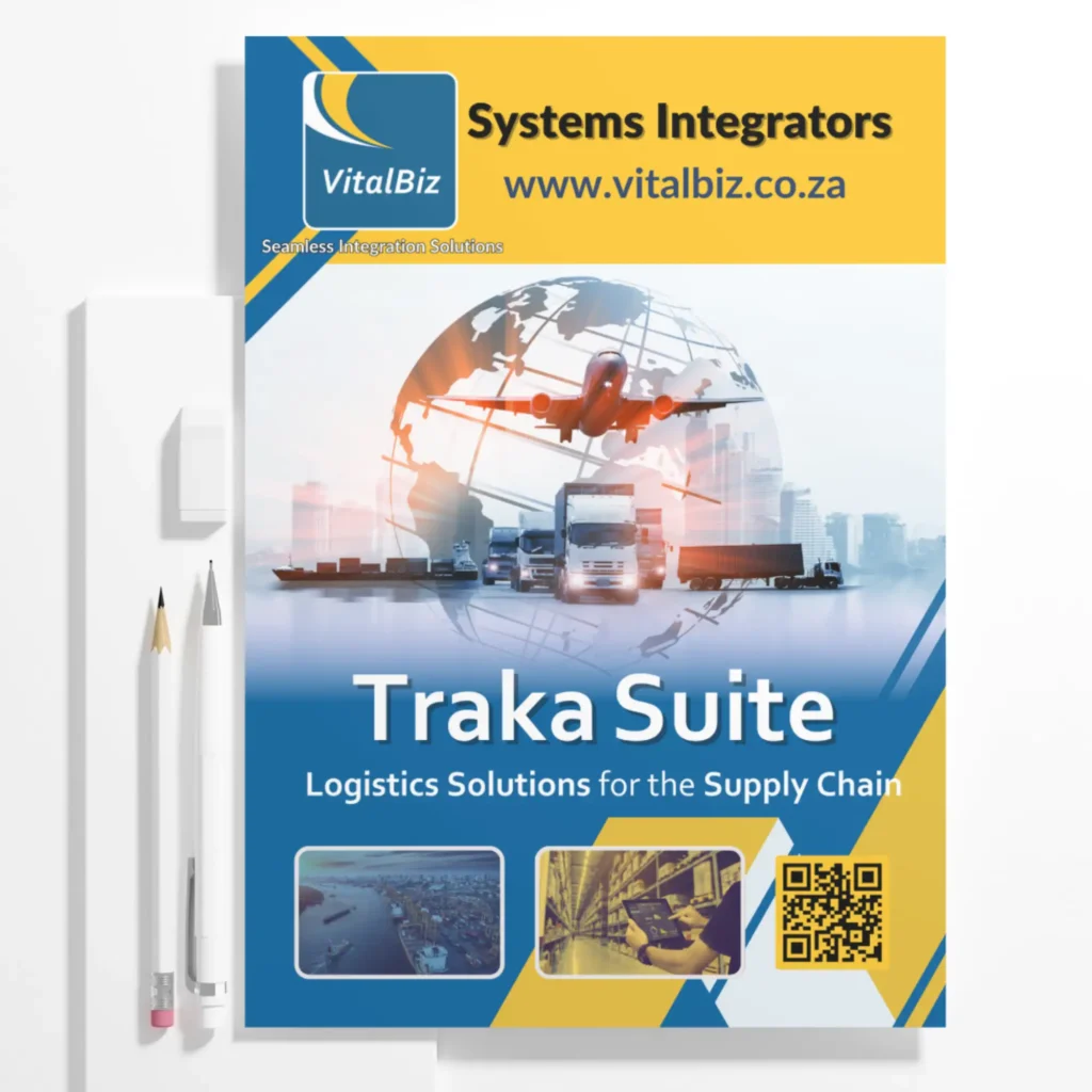
Company: VitalBiz
VitalBiz Traka Suite
FORMAT: 8-Page A4 Portrait Technical Publication
INDUSTRY: Information Technology (IT) and Software
We engineered an 8-page technical narrative that translates complex EDI/Logistics software into a visual 'Ecosystem Map,' reducing the cognitive load for B2B stakeholders.
The Business Perspective (The Strategy)
Focus: Solving operational friction and driving B2B conversion.
From a strategic standpoint, the objective was to bridge the ‘Complexity Gap’ inherent in high-end SaaS logistics. By mapping the 8-stage container journey, the layout functions as a Consultative Sales Tool. It systematically identifies industry ‘Pain Points’ and pairs them with specific software solutions (Traka, AcTraka, etc.), effectively reducing the sales cycle by delivering a clear, results-oriented value proposition to C-suite stakeholders.
The Design Angle (The Execution)
Focus: Information architecture, typography, and visual systems.
The execution relies on a Modular 12-Column Grid to maintain order across dense technical datasets. A sophisticated Wayfinding System uses color-coded iconography and linear process mapping to guide the reader’s eye through the ‘End-to-End’ lifecycle. By balancing high-impact industrial imagery with generous white space and Montserrat-driven typography, the design achieves a ‘Technical-Premium’ aesthetic that reinforces the brand’s authority.
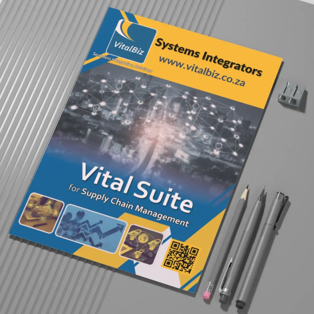
Company: VitalBiz
VitalBiz Vital Suite
FORMAT: 11-Page A4 Portrait Technical Publication
INDUSTRY: Information Technology (IT) and Software
We created a high-authority technical publication that deconstructs complex ERP modernisation into a modular 'plug-and-play' ecosystem, utilising linear flow-architecture and custom iconography to visualise the seamless integration of diverse B2B trading channels.
The Business Perspective (The Strategy)
Focus: Operational Scalability and ERP Modernisation.
Strategically, this project was designed to address the fragmented nature of B2B trading. The business objective was to present a modular ‘plug-and-play’ ecosystem that allows companies to modernise their supply chain without the risk of a full ERP replacement. By framing the software around ‘Pain Point Resolution’ – specifically targeting manual data entry errors and system silos – the brochure speaks directly to the CFO’s desire for increased profitability and reduced operational friction.
The Design Angle (The Execution)
Focus: Data Visualisation and Brand Cohesion.
The design execution utilises a sophisticated Flow-Architecture to visualise the invisible journey of a B2B transaction. We employed a consistent iconographic language to differentiate the various ‘Vital’ modules (eOrders, eTrada, eMobi) while maintaining a unified corporate identity. A key feature of this layout is the ‘Centralised Processing’ infographic, which uses a clean, vertical hierarchy to show how diverse order captures – ranging from RFID to Telesales – are funnelled into a single, automated B2B engine. This creates a visual sense of ‘Order from Chaos’ for the reader.
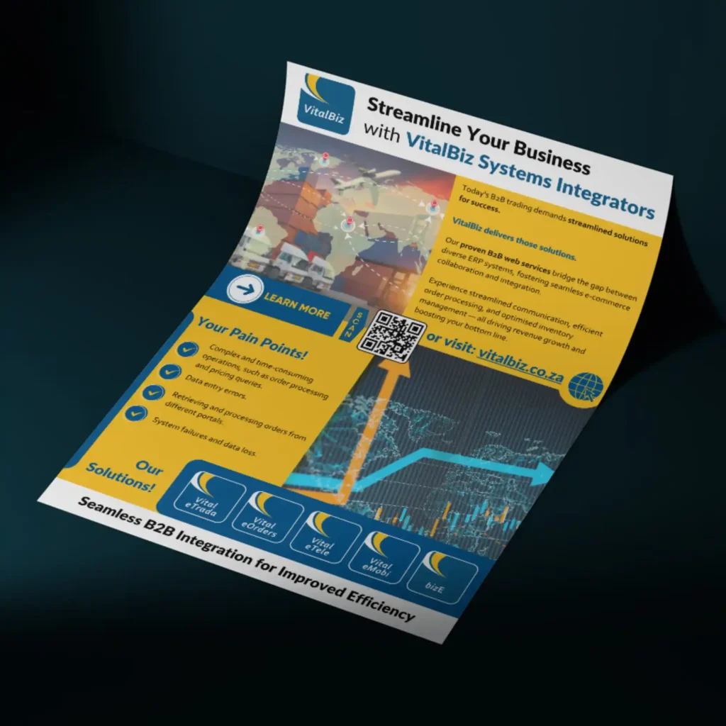
Company: VitalBiz
Pre-Brochure Digital Interest Flyer
FORMAT: Single-Page A4 Digital Teaser & Outbound Lead Flyer
INDUSTRY: Information Technology (IT) and Software
We developed an agile, high-impact digital teaser flyer designed as an email-first lead qualification asset. It distillates complex enterprise B2B capabilities into a rapid 'Problem-vs-Solution' framework to gauge prospect intent before deploying multi-page technical documentation.
The Business Perspective (The Strategy)
Focus: Lead Nurturing, Interest Qualification, & Frictionless Conversion.
In high-value B2B sales cycles, sending comprehensive 14-page publications upfront can create cognitive overload and drop-off. The commercial objective here was to deploy a lightweight digital precursor for sales outbound campaigns. By summarising the core value proposition and highlighting high-frequency operational bottlenecks (data entry errors, portal fragmentation, system failures), the flyer acts as a rapid diagnostic tool. It allows prospects to immediately self-identify their pain points and triggers a low-friction action (scanning the QR code or visiting the site) to qualify leads into the sales pipeline.
The Design Angle (The Execution)
Focus: High-Density Hierarchy, Split Matrix Layout, & Immediate Calls-to-Action.
4-Quadrant Layout Matrix: We structured the single-page canvas into four distinct visual zones to facilitate rapid scanning:
- Top-Left Imagery & Positioning: Global supply chain imagery (air, sea, road) paired with the master logo establishes immediate industry authority.
- Top-Right Value Proposition: Clean, high-contrast typography over corporate gold summarising core web service capabilities.
- Mid-Page Focal Point (CTA Strip): A high-visibility central bar combining an explicit “LEARN MORE” button, a prominent QR code (“SCAN”), and a direct web URL to maximise click-throughs and mobile engagements directly from email viewports.
- Bottom ‘Problem vs. Solution’ Split: A side-by-side comparison pairing checkmarked client pain points against a horizontal suite of proprietary solution icons (Vital eTrada, eOrders, eTele, eMobi, bizE) grounded over financial trajectory graphics.

Company: UTD Aluminium
FORMAT: 32-Page A4 Portrait Technical Publication
INDUSTRY: Manufacturing and Construction
We created an architectural-grade publication that justifies premium market positioning by highlighting UTD’s 'tool-and-die' precision and vertical integration, balancing minimalist layout with high-impact visual proof of their in-house manufacturing and installation expertise.
The Business Perspective (The Strategy)
Focus: Market Differentiation and Vertical Integration.
Strategically, the objective was to position a family-owned manufacturer as a superior alternative to mass-market suppliers. The narrative highlights Vertical Integration – emphasising that nearly every component is engineered and manufactured in-house. This strategy targets the high-end residential and commercial sectors by selling ‘Precision and Accountability.’ By focusing on their 40-year heritage and tool-and-die maker DNA, the brochure justifies a premium price point through the promise of uncompromising quality control and local expertise.
The Design Angle (The Execution)
Focus: Visual Proof and Material Elegance.
The design execution mirrors the product itself: clean, structural, and transparent. We utilised a Visual-First Layout, featuring large-scale architectural photography to provide ‘Social Proof’ of their installation quality. To balance the imagery, we employed minimalist typography and structured data blocks to explain technical certifications (like SAGGA-rated glazing). A key design element is the focus on Signature Innovations, such as the slim-profile Cottage Pane and high-capacity Parliament hinges, which were given dedicated ‘Feature Spreads’ to showcase the technical superiority of their in-house engineering.
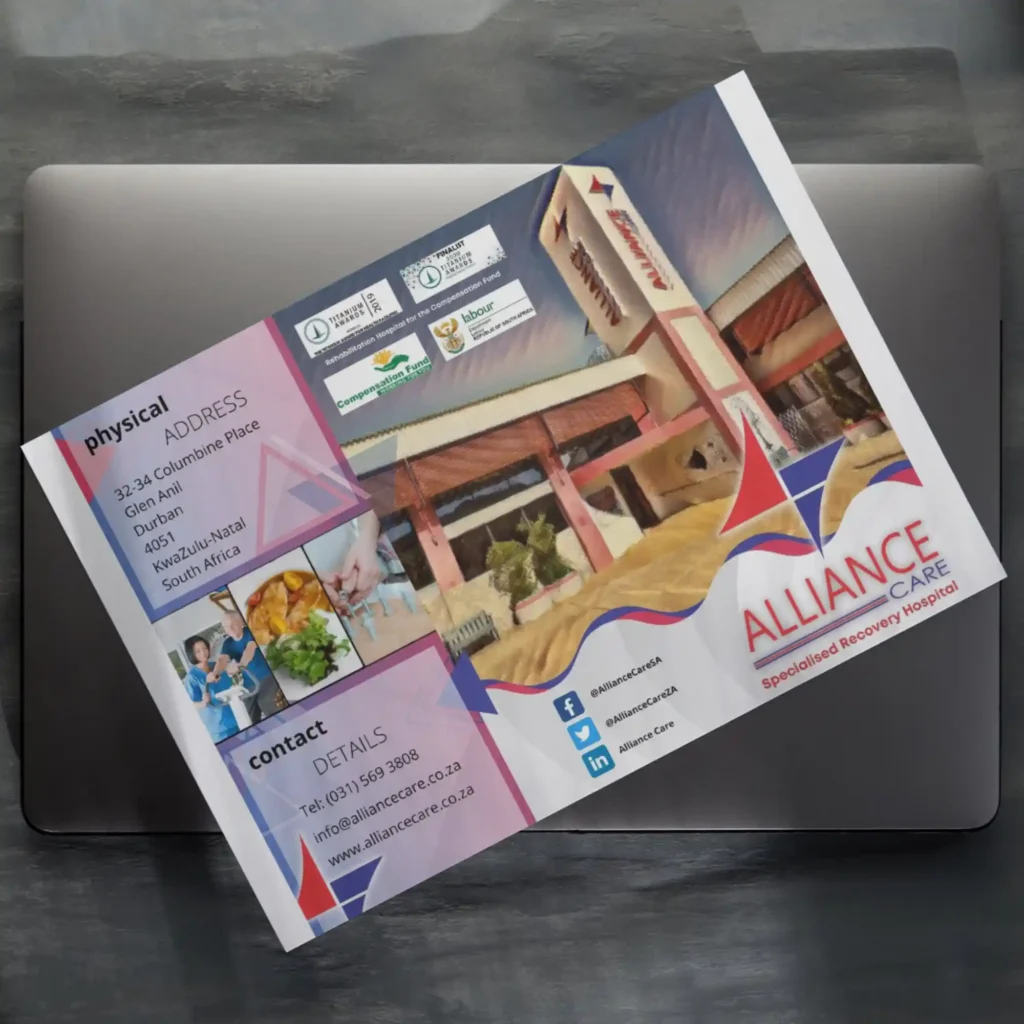
Company: Alliance Care
FORMAT: 6-Panel A4 Z-Fold Healthcare Brochure
INDUSTRY: Healthcare
Our focus was on designing a multi-panel clinical communications system that translated complex, high-stakes medical rehabilitation pathways into a structured, patient-centric narrative. By balancing institutional accreditation with accessible healthcare education, we created a strategic tool that bridges the gap between clinical authority and emotional reassurance for families in medical crisis.
The Business Perspective (The Strategy)
Focus: Institutional Trust and Regulatory Authority.
Strategically, this project was designed to position Alliance Care as a Tier-1 medical facility within a highly regulated healthcare landscape. The business objective was to secure “Top-of-Mind” status for referring medical practitioners and the Department of Labour by highlighting COHSASA accreditation and Titanium Awards. By framing the facility around “Goal-Oriented Recovery,” the brochure addresses the primary concern of stakeholders: clinical outcomes and the transition from acute crisis to functional independence. It serves as a physical proof-of-competence that justifies the facility’s role in the specialised sub-acute sector.
The Design Angle (The Execution)
Focus: Information Architecture and Modular Navigation.
The design execution utilises a strict Z-fold Grid System to categorise dense clinical data into digestible “Information Pockets.” We employed a dual-persona hierarchy: using bold, red-and-navy typographic anchors to signal “Medical Excellence” to doctors, while utilising icon-led “Goals of Recovery” sections to provide clarity to patients.
A key feature of this layout is the Credentialing Panel, which clusters the Department of Labour seals and international accreditation logos into a “Regulatory Anchor.” This creates an immediate sense of “Safety and Compliance” before the reader even engages with the text. The use of generous white space and clean, sans-serif typography ensures that the brochure remains “Audit-Ready” and accessible, reflecting the orderly and precise nature of a high-performance medical environment.
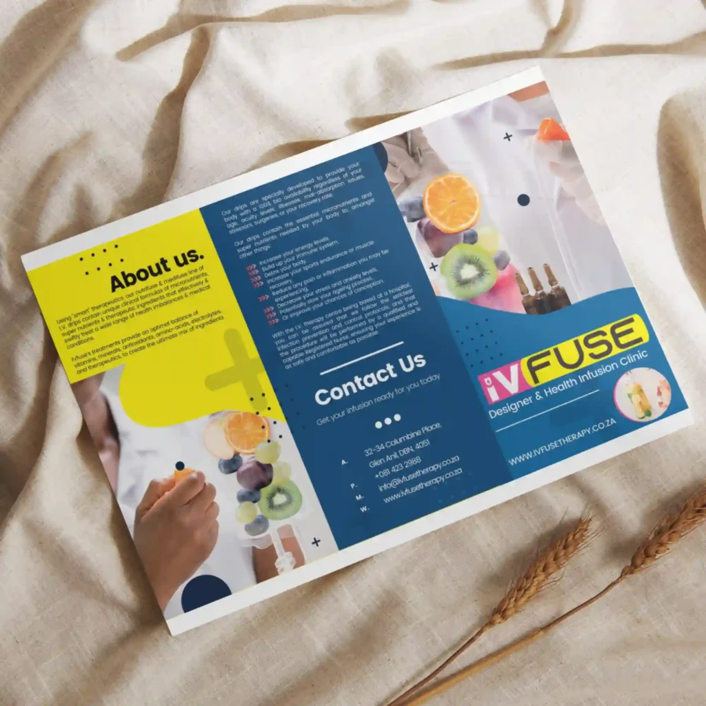
Company: IV Fuse
FORMAT: 6-Panel A4 Z-Fold Health and Well-Being IV Treatment Marketing Brochure
INDUSTRY: Health and Wellness
We approached this project with a high-impact wellness communications system that transforms clinical nutrient therapy into an accessible, 'designer' lifestyle service. By utilising high-contrast colour blocking and a modular pricing architecture, we created a versatile marketing tool that navigates the intersection of medical precision and consumer-facing retail aesthetics.
The Business Perspective (The Strategy)
Focus: Market Differentiation and Service Accessibility.
Strategically, this project was designed to move IV therapy out of the “hospital” context and into the “wellness” space. The business objective was to present a wide array of specialised treatments (Nutrifuse & Medifuse) in a way that feels premium and curated. By framing the treatments around specific lifestyle outcomes – such as “Energy Boost,” “Anti-Ageing,” and “Athletic Recovery” – the brochure speaks directly to the aspirations of high-performance professionals and health-conscious consumers. It serves as a visual “menu” that simplifies complex micronutrient formulas into clear, benefit-driven value propositions.
The Design Angle (The Execution)
Focus: Visual Vibrancy and Content Chunking.
The design execution utilises a High-Contrast “Neon” Palette to break away from traditional sterile healthcare blues, creating immediate visual momentum. I employed a Modular Content Strategy, using distinct color-coded panels to separate general wellness education from the specific “Drip Menu” and technical medical benefits.
A key feature of this layout is the Iconographic Benefit Grid, which uses numbered sections to highlight the “Top 6” benefits of IV therapy. This allows for “Scanning-First” reading, where a client can understand the value of the service in seconds. The integration of high-resolution “Liquid Splash” photography reinforces the core product – hydration and vitality – while the bold, rounded typography maintains the brand’s “Human-Centric” yet “Precisely Engineered” vibe.
Digital Brand Stewardship & Campaign Ecosystems